I’ve blogged recently about my new found love of Greek Yogurt. I’ve also admitted that I have no preference and little to zero knowledge about how to buy yogurt. You’d think after stating this twice (if not more), I would have done some research. Nope.
Well today, I’m in Philadelphia and I stopped at a 7-11 on my way to my boyfriend’s apartment. I like to have an afternoon snack and I didn’t want to risk that in the middle of the current rainstorm I’d be forced to leave the comfort of my afternoon nap for yogurt. So, I just pick up 3 yogurts for the time that I’m here.
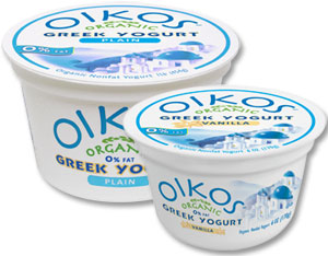
So far in my yogurt explorations, I’ve been minorly critical of a few brands – but haven’t really developed any allegiances. This brand though – Oikos by Stonyfield Farms – is not on my shopping list anymore. Not only do I not like the taste as much as the others…. I find the packaging terribly annoying.
Let me elaborate.
This container looks normal – right? Yes, you are right. See, here I am with the container. Yes, I know the words are backwards… that’s what happens when you use your webcam to take pictures.
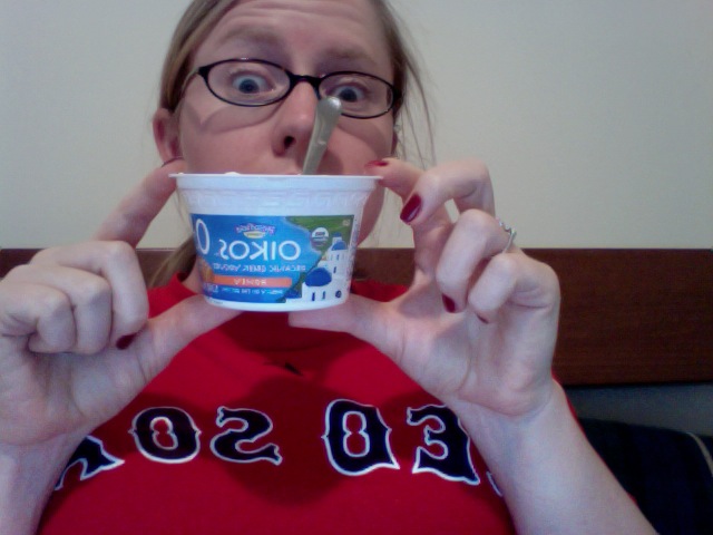
My complaint is that … Oikos decided to get fancy with their container… and they made some weird Greek letters – or some other pattern… on the rim of the container. This would be fine if you didn’t like to leave your containers spotless like I do.
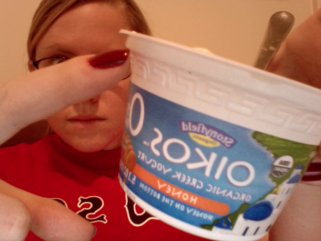
Because of this pattern, I feel like I left some precious little bits of tasty (moderately tasty), over-priced yogurt behind. This embellishment on the container clearly costs money to do, and I bet that nobody would care if it was missing.
I know I sound crazy. I know this is a bit ridiculous – but if they had asked me as a product tester what I thought about this, I would have told them their yogurt was fine and their container was annoying. Too many nooks and crannies.
(and now I sound like a granny…)
(I hope you noticed that I rhymed that last part)